CALL ME: 01970 871072

I'll be happy to help

Read some Testimonials Pixelwave Web Design Aberystwyth Logo

Website Design Aberystwyth, Wales

Creativity - Innovation - Results

Pixelwave Web Design is a one-person website design studio based near Aberystwyth in Wales, UK. My aim is to provide cost effective website design production and maintenance by offering professional web solutions that stand out from the crowd.

Archive for the 'Web Site Design' Category

Website Design for Dental Practice

Friday, September 21st, 2007

As anyone who reads the latest news articles here at Pixelwave Web Design will know, despite working for clients from all over the world, I always enjoy working for local businesses and organisations here in Wales. I like being able to meet with the people behind the projects face to face, I like serving the local communities and I find it is good for business as word of mouth recommendations tend to work best in the local area.

I’m therefore pleased to be starting work on a brochure style website for a dental practice in Rhayader. The website will help promote the business and provide information and advice to existing patients. Most of the content and much of the design will be based on existing printed promotional material and the site should go live later this year.

Website layout

Dating Website Scripts and Templates

Tuesday, September 11th, 2007

Dating Website ScriptOne of the most common enquiries I get is to build dating websites for people. Dating websites are big business and with many niche interest dating sites being created many people have big ideas to set up a dating website for their particular niche interests. Pixelwave Web Design already offer several dating website templates through our website template section. These templates are really just the ‘skins’ for a dating website, they don’t contain all of the back-end functionality such as the database to store members profiles and all of the scripts allowing them to interact with the site. In effect the templates are just the aesthetic front-end for a dating site.

The real work behind the scenes is carried out by software designed to provide the functionality required from a dating website. Building such a site would be prohibitively expensive for many people, so I have now added the ability to purchase an off the shelf dating website called PG Dating. There are many advantages other than cost for using a tried and tested package such as this and it saves you having to ‘re-invent the wheel’. The really nice thing about this particular package is that the developer will integrate it with any of the dating website templates, to provide a fully functional and aesthetically pleasing site.

Web Design for Engineering Company in Wales

Wednesday, September 5th, 2007

Pixelwave Web Design is hoping to start work on the development of a new website for a local engineering company based in Lampeter, Wales.

RJ Little Engineering specialise in the manufacture of catering trailers and have approached Pixelwave Web Design asking me to build a website that will promote their business and more importantly provide additional information for potential customers.

As yet I know very little about the company or the content of the site but the domain names are registered, hosting account set up and we shall be meeting soon to discuss their exact requirements. I invariably enjoy initial meetings with clients, especially when I can do them face to face. Not only does it get me meeting new people rather than staring at computer screens all the time, but it allows me to get excited and motivated about the new project. It also gives me an opportunity to pass on some of my knowledge and to make suggestions for the website that the client may not already have thought about.

I am looking forward to starting work on this project and already have a few ideas that will hopefully excite my client too.

Web Design Feedback

Friday, August 31st, 2007

As always it is good to receive feedback from my clients. In fact, at the end of a project I actively request some feedback by asking my clients “was anything I could have done to improve the website design process or the service I provided” for them.

Most of the time the feedback is positive, as with the email I received recently from Ffos-y-Ffin Corporate Leadership Training:

It has been great to work with you too, and we will be more than happy to recommend you to others!
Nothing needs improving as far as I can see. You go out of your way to be accurate and helpful.

It is reassuring to know that my clients are more than happy with the services I provide and the end results of my labours. I am of course always looking to improve my services which is why I ask these questions, just in case any of my clients have any suggestions for improvement.

Website Development for Online Estate Agents

Friday, August 24th, 2007

Pixelwave Design has just started work on the management and development of a London based online estate agents.

Website for Estate AgentsThe plan for their website is to allow people to register and then advertise their properties for sale or lease for a one-time fixed fee. This fee will provide the advertiser with a detailing listing of their property until it is sold. there will be no commission fees and no time limit on the advert. The one time fee will also include the provision of a ‘For Sale’ sign for display at the property.

The website will be easy to use allowing anyone to search through the properties using various search criteria such as number of bedrooms, location, type of property etc etc. Listing a property will also be easy, payments will be made online through a secure payment gateway and advertisers will be able to add full details of their properties along with photos and location maps.

Site administrators will be able to manage members subscriptions and listings as well as control numerous parameters concerning the properties. They will also be able to control various aspects of the site functionality and settings from within a secure administration panel.

Pixelwave Design has already started work on this project and is looking forward to making progress over the next few weeks. Watch this space for updates.

Website Design for Organic Pig Farm in Wales

Friday, August 3rd, 2007

Pixelwave Web Design is just starting work on a new website design project for an organic pig farm based in Wales.

Pigs on Weed - Organic Pig Farm WebsiteThe website is intended as a promotional tool for ‘Pigs on Weed’, providing visitors with information about organic pork from pigs raised in a woodland environment in the Brecon Beacons. It will be a simple, but attractive brochure-style website built to Pixelwave Web Design’s usual high standards of accessibility, standards compliance and ‘search engine friendliness’.

Work has started on the site and I am looking forward to making good progress with it.

Team Leader Website Goes Live

Thursday, August 2nd, 2007

The release of a new website is always an exciting time for both Pixelwave Web Design and our clients. Today sees the website of Ffos-y-Ffin, a corporate team leadership and mountain sports provider go live.

Ffos-y-Ffin are based in the Brecon Beacons and offer exclusive corporate leadership development courses and teambuilding events for all types of groups. Using tried and tested methods their courses not only look exhilarating but offer guaranteed results.

Their new website provides information on the courses and weekends they offer, photos, testimonials and contact information. They also have a Content Management System that allows them to add new articles to the site. They intend to use this ‘News and Reviews’ section as a photo gallery, news section and weekend review system. Not only will this allow them to keep their site up to date, but it will improve their rankings within search engine results and save them time and money on website maintenance and updates.

As always, Pixelwave Web Design wish them every success and look forward to working with them in the future.

Ffos-y-Ffin Website Screen Grab

Website Redesign – Part Two

Monday, July 23rd, 2007

This article explores some of the decisions behind the recent redesign of this website. It examines the motivation, inspiration and aims behind the design choices and some of the compromises made along the way. Don’t worry, it won’t be technical, we are looking at ‘why’ rather than ‘how’.

This is Part 2 of the article which runs through the actual re-design process. Part 1 can be read here, it sets the scene explaining my motives and inspiration behind the idea.

The Redesign.

Step 1:

Step 1 of the redesignThe first thing I did was simply change the colour scheme to one with a white background and black text rather than the overbearing dark blue of Pixelwave 1.0. (See screen shot 1) Obviously this didn’t look too pretty, but it gave me the beginnings of a blank canvas to work from.

Step 2:

Step 2 of the redesignI wanted to keep the main structure the same so there was no need to remove styling that controlled the layout. However, Pixelwave 1.0 was a fluid design where the right hand column expanded to fill the browser window. Whilst this was good at utilising screen space, it did look a little unbalanced on larger monitors, so to regain control I plumped for a fixed width design which did mean a few adjustments to the overall layout. Next, the whole thing was centred to fit in with the new fixed width layout, the old title images had to go along with a few other images, and some simple styling was applied to the text to make it larger and easier to read.

Step 3:

Step 3 of the redesignThings were beginning to take shape, already the site looked brighter and easier to read. But it was lacking in ‘punch’ and looked a little bland. A few more tweaks to the styling and soon the main body of text and the right hand column were looking more interesting. I was tempted to stop here, many of my motives had been achieved. The site was easier to read, felt more modern and I preferred it. However, I hadn’t really addressed the most important issues of readability and scanning.

Step 4:

Until now none of the content had been touched. One of my favourite web usability books is ‘Don’t make me Think’ by Steve Krug. In this book his third law of usability is ‘Get rid of half the words on each page, and then get rid of half of what’s left’. Unfortunately, I like content and lots of it, so although I probably should, I wasn’t about to rewrite the site. Instead, I wanted to create a large, prominent summary of each page so that visitors could quickly scan the page and find out what it was about. If they were interested they could then delve deeper into the actual content.

Step4a of the redesignAs I had yet to replace the title images removed in Step 2, I decided to create a large title area above the main content which was to contain the pages title and a brief summary of the page.


Step 4b of the redesignI then added some styling and this area also provided space for a graphic to bring the page alive. Each page now had a purpose and it was immediately obvious what it was about.

Final Tweaks:

I was now pretty happy with the site, but felt that the main navigational elements across the top may not be prominent enough. To address this I restyled these links so that the current page was more clearly highlighted. I also changed the branding and identity around a little, although I’m still unsure about this and may revert to the older version.

The Result

The results of my redesignIn case you are reading this elsewhere, the final result can be seen at http://www.pixelwave.co.uk. Overall I’m pleased with the design. A few compromises were made along the way, but that is almost always the case. I’m still not entirely happy with the main navigation, but that may have changed by the time you are reading this. I hope you like the new look, find the information you are looking for and look forward to hearing from you should you be able to use the services offered by Pixelwave Web Design.

Website Redesign – Pixelwave 2.0!

Monday, July 23rd, 2007

This article explores some of the decisions behind the recent redesign of this website. It examines the motivation, inspiration and aims behind the design choices and some of the compromises made along the way. Don’t worry, it won’t be technical, we are looking at ‘why’ rather than ‘how’.

The article is split into two parts the first part sets the scene explaining my motives and inspiration behind the idea. Part 2 runs through the actual re-design process.

Motivation

As with any website re-design, there were various motives behind the redesign of Pixelwave Web Design’s site. Some of these were simple personal aesthetic preferences, others were aimed at making the site better for its visitors.

To start with I simply wasn’t happy with the existing design and wanted something new. Now, this in itself is rarely a good enough reason to redesign a website. As a website owner you probably see your website several times a day, but you have to remember that most visitors to your site won’t see it that often, and many won’t have seen it before. Therefore what looks old and jaded to you can look new and fresh to someone else. Also, most people visiting your site won’t even think twice about the design, all they want is good quality content along with easy access to that content. If they can find what they are looking for the actual design should be immaterial to them. As long as it isn’t plain ugly, the actual design shouldn’t enter their thoughts.

Of course, fashion changes and re-designs simply for aesthetic reasons are often needed, but I think it is important to look at your website from the point of view of the typical user rather than as the website owner.
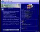
The original Pixelwave Web Design WebsiteWith Pixelwave Web Design there were also some historical reasons behind my motives for change. Pixelwave 1.0 (a screenshot of which can be seen here) was built in quite a hurry following an unexpected name change from Tsunami-Site-Design after the Asian Tsunami disaster of 2004. I used this name change as a new beginning and to reinforce my commitment to offer first class customer support and to build standards compliant, accessible, user friendly websites. With this new beginning came lots of new content for the site, many new pages and therefore a new information architecture. The website was built from the ground up and in my excitement to add so much new information my priorities were aimed at the content and site structure rather than the look. Content, after all, is King. I was therefore never completely happy with the design so a redesign has always been on the cards.

In addition to these purely aesthetic motives, I also wanted to make the site easier for people to read. People rarely ‘read’ websites, more often than not they just quickly scan them. Making the site more ‘scanable’ was therefore another of my priorities.

Inspiration

Overall, I was happy with the information architecture and general layout of Pixelwave 1.0. I wanted to keep the main horizontal navigation and I was happy with the two column layout. I wanted to keep the main content on the left and have a right hand column containing subsidiary information and links. Inspiration for the general layout therefore came from the existing site.

I also had a nostalgic fondness for the clean, bright, fresh look and feel of my original Tsunami-Site-Design website (click here to see this site). So, the white, light blues and green highlight colour-scheme came from there. Also, as this was to be Pixelwave 2.0 I took some inspiration from the Web 2.0 design style. This style often features large, easy to read text , lots of white-space, subtle gradients, and reflective graphics.

Examples of other site using a Web 2.0 style design (as of July 2007) include: Firefox, 37 signals, Ruby on Rails and Mochikit.

So, the scene was set, the site needed a re-design, my motives and aims were clear and the site was to be a combination of its two predecessors with a twist of Web 2.0.

In part two we’ll examine the actual process of redesigning the site, complete with lots of screenshots on the way.

Borth Holiday Accommodation Website

Monday, July 23rd, 2007

Work is now underway on Pixelwave Web Design’s latest project for a holiday accommodation provider here in Borth and Ynyslas.

Aberleri Seaside Cottages are a group of luxury cottages situated on an old farm just moments away from the lovely golden sands of Borth. The owners live in Borth and take great pride in the cottages. Their proximity to Pixelwave Web Design also means that I have been able to meet with them several times already and seem to have become their ‘computer guru’ even before their website goes live.

They have even had an enquiry for accommodation already thanks to the fact that I mentioned I was about to start work on their website design project in a previous news article here.

Their website will be an attractive brochure style website designed to integrate well with their printed promotional material. As well as working directly with the cottage owners, Pixelwave Web Design are in close contact with their copy-writer to ensure that the website and printed material compliment each other perfectly.

Website Design Comp for holiday accomodation in Wales